
Spotify
Overview
Spotify is the current industry leader in music streaming services. Its mission is “to help people listen to whatever music they want, whenever they want, wherever they want—in a completely legal and accessible way.” In order to maintain their leading position, Spotify wants to improve engagement and retention in the app by expanding upon their social capabilities.
Objective
The aim of this project is to define a way forward in developing Spotify’s social capabilities, as well as provide a prototype of the added feature(s), integrated seamlessly within the rest of the app
This is a speculative project and not associated with Spotify.
Role: UI/UX Designer
Research
Interaction Design
Visual Design
Timeline: 2 weeks
Deliverables: App Prototype & Branding
Tools: Sketch, Adobe Illustrator, Invision
Process


RESEARCH
Goal: To understand the current industry and audience through research
Process: Market Research | Competitive Analysis | User Interviews
Market Research
Understanding Spotify’s position in the music streaming service industry was the first step of the research process. My goal was to determine what Spotify’s existing audience looks like, as well as become familiar with its existing social capabilities.
Demographics
Spotify Users by Age

Spotify Users by Gender

Statistics
217 million monthly active users (as of Q1 2019)
100 million of these were Spotify Premium subscribers (as of Q1 2019)
Year-to-year 25% increase in users, 32% increase in subscribers
44% of monthly active users use Spotify on a daily basis
⅓ of listening time is spent on Spotify-generated playlists, ⅓ is spent on user-generated playlists
Existing Social Capabilities
Spotify Codes
Integration with existing social media, i.e. Instagram stories, Twitter feed, Facebook Messenger
Collaborative Playlists
Removed Feature
Inbox/Messaging removed in 2017
“Extensive data analysis has shown that this feature has very low engagement”
Plans to focus more on integrations with third-party messaging apps
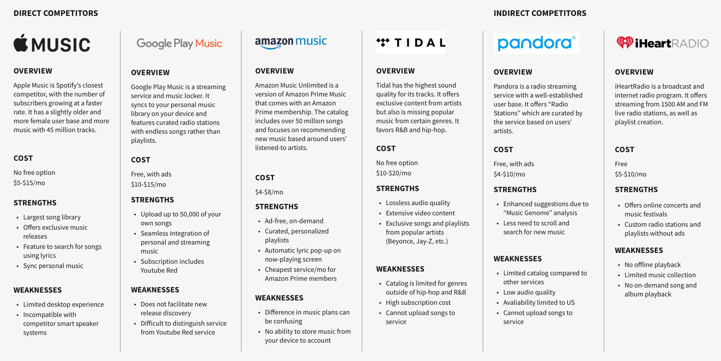
Competitive Analysis
Spotify is the current leader in music streaming services, with more monthly active users than any of its competitors. I examined the those competitors, comparing their strengths and weaknesses, to understand how Spotify might distinguish itself from the rest of the market.
User Interviews
I then moved forward to primary research stage, which consisted of 1:1 user interviews. The goal was to understand users’ current experience with Spotify and how they find and share music. Interviews were conducted in-person and screened to determine if they were Spotify premium users.
Number of Participants: 5
Gender breakdown: 3 male / 2 female
Age: 23-36
All participants were Spotify Premium users

Define
Goal: To define the target user’s needs, goals, motivations and frustrations based on research findings
Process: Empathy Map | Persona | POV Statements & HMW Questions
Empathy Map
I transcribed and synthesized my user interview findings using an empathy map. Organizing my notes based on patterns and trends that emerged revealed insights about user behaviors, which led me to determine user needs.

Insights
Users seek music similar to the artists they like
Users often listen to music recommendations together in person
Users share music through social media platforms
Needs
Users need to find new music based on artists they already like
Users need to be able to share music in person
Users need to be able to share music across multiple platforms
Persona
Having synthesized my primary research, I was then prepared to develop a primary persona who would be representative of my target user. In addition to needs gathered from the empathy map, the goals, frustrations and motivations of Tim, brand manager and music enthusiast were also determined from the user interviews.

POV Statements & HMW Questions
Next, I reframed the insights and needs identified from the user interviews as Point-of-View statements and How-Might-We questions. In doing this, I was able to define the problem in a way that would open the door to ideate more solutions.

Business & User Goals
I then identified the business goals, in addition to the user goals. The point where these two sets overlapped resulted in the project goals, which I focused on meeting within the project.


IDEATE
Goal: To develop concepts for potential solutions based on research insights
Process: Group Brainstorming | Product Roadmap | Sitemap | User Flow | Task Flow
Group Brainstorming
My first step in the ideation process was facilitating a group brainstorming session. I gathered 4 participants and led them in brainstorming answers to each How-Might-We question, writing ideas down on sticky notes and expanding on each through discussion. This process helped generate a greater range of ideas than an individual brainstorming session.

Product Roadmap
I reviewed the ideas from the brainstorming session to determine which concepts seemed to most effectively provide answers to the How-Might-We questions. These ideas were organized into a product roadmap that would provide a high-level guide for each feature. The product roadmap includes metrics that will allow the impact and effectiveness of the features to be assessed.

SitEMap
I then developed a site map in order to visualize the relationships between new and existing features. I used the understanding gained examining the current app, as well as insights from user interviews to determine where the new features should be positioned within the established app structure.

User Flow
With the project goals and Tim’s needs in mind, I created a user flow diagram, identifying the key screens and interactions he would need in order to find an artist similar to one he already likes using the new features. By mapping these pathways out, I was able to define required screens and develop a logical flow.

Task Flow
In addition to the user flow, I mapped out the path users would take to accomplish additional tasks. This helped to define the key screens and interactions required to utilize any additional new features.


Design
Goal: To design and integrate the UI of new features into the existing Spotify app
Process: Sketches | Branding
Sketches
I started the design stage by sketching out ideas for layouts, including the features defined in the product roadmap, and referencing the task flows, user flow, and sitemap. These low-fidelity wireframes were a quick and efficient method for developing visual hierarchy and planning out key screens required to for a user to find new artists and find music based on their current mood.

Branding
I created a style tile as a means for understanding Spotify’s existing branding. I determined the typography styles, color palette and imagery. This step prepared me for applying Spotify’s distinct visual design to the new features, which would then help me to integrate those features seamlessly into the existing app.


Prototype
Goal: To develop a model for Spotify’s app that could be evaluated and improved
Process: High-Fidelity Wireframes | Usability Testing | Affinity Map
High-Fidelity WireFrames
I implemented the new features in high-fidelity wireframes, making sure to adhere to the design direction outlined in the style tile and referencing elements in the existing app. These wireframes were then used to build a prototype to be used for usability testing.

Usability Testing
I prepared for conducting usability testing by developing three scenarios and specifying three tasks I would be asking participants to complete. Participants for testing were recruited from the local community and recorded each session so I could later synthesize my findings.
Tasks
Find a playlist to match your current mood
Find a new artist like the one you’re currently listening to
Identify the song your friend is playing and add it to your favorites
Summary
Number of Participants: 5
Age: 23 - 35
Gender Breakdown: 3 male / 2 female
All participants are Spotify premium users who use the iOS mobile app
AFFINITY MAP
After completing usability testing, I transcribed my notes and recordings, organizing my observations using an affinity map. By grouping these notes based on patterns and trends that emerged, I was able to interpret and prioritize my findings.

Insights
Users immediately went to search page to find a playlist for their mood
Users were unsure of what would happen when using the mood tool
Users did not immediately notice the button for the mood tool on the home page
Users did not immediately notice that the voice search function could identify a song
Recommendations (From High to Low Priority)
Move CTA for Mood tool to Search page
Display results for mood tool like search results
Add results preview to indicate sample of what to expect when applying mood tool
Update “voice search” page to make clear that the feature will also listen for music

Iterate
Goal: To assess how well the prototype meets users’ needs and goals
Process: Revised Wireframes | Revised Prototype | UI Kit
Revised Wireframes
The insights from usability testing were used to update the wireframes in ways that addressed the points of frustration, confusion and hesitation with the added features. The major changes for improving usability are annotated below.

Revised Prototype
Those wireframes were then used to build the second iteration of the prototype that can then be used for additional evaluations.
UI Kit
Finally, with the tested prototype revised, I created a UI Kit using the elements from the designs. This document can continue to be updated as the new features are further developed in order to ensure that the style and branding remain true to Spotify’s current design.

project takeaways
Testing is key.
A major revelation from usability testing was with the placement of the mood tool within the app. My findings corrected an assumption I made about where users would naturally look to find playlists that fit their current mood and I moved that feature from the home page to the search screen. This process really made clear that the effectiveness of a particular design is ultimately determined by the people who use it.
Study the existing app.
Examining Spotify’s existing UI and style was a key step in the design process. By identifying the design and application of particular elements in the current app, I had specific references I could utilize in my added features. Design decisions should be intentional and understanding Spotify’s design helped me to ensure the new features were seamlessly integrated.
Next Steps
With more time, I would like to perform additional usability testing to determine how well the changes made to the first prototype mitigated the confusion that occurred during the first round of evaluations. In particular, I would like to find out if the “listen and identify a song” feature worked as a step within a task flow to access an artist or add a song to a playlist. Knowing how users proceed after identifying a song using the feature is a valuable way to understand just how seamless the integration of the feature is within the app.