
Book Ink.
Overview
Book Ink. is an app for avid readers and book lovers, that will help them keep track of what they’re reading as well as discover their next favorite book. A user-friendly, fresh, and clean design will distinguish Book Ink. from the competition.
Objective
Book Ink. requires a design for an iOS mobile app, along with clearly defined branding that can be presented in a prototype that effectively shows the key features users need from a book inventory app.
This is a speculative project and Book Ink. is a fictional company.
Role: UI/UX Designer
Research
Interaction Design
Visual Design
Timeline: 2 weeks
Deliverables: App Prototype & Branding
Tools: Sketch, Adobe Illustrator, Invision
Process


RESEARCH
Goal: To understand the current industry and audience through research
Process: Market Research | Competitive Analysis | User Interviews
Market Research
I began the project with market research, in order to establish an understanding of the reader population and trends within the digital library industry. I focused on discovering what the average reader looks like, what they are reading, how they are accessing reading material.
Who is Reading
People aged 20-34 read the least, while people ages 75+ read the most
Women read more than men
The richest adults are 3 times more likely to read than those with a household income lower than $30K
College graduates are more than 5 times more likely to read a book than those with a high school diploma
People in suburban regions are most likely to read, followed by city- and rural-dwellers
What are People Reading
Adult nonfiction revenue increased, while adult fiction decreased over the same time period
Young adult book revenue increased
Audiobooks are the fastest growing format
How are People Reading
Number of e-book readers on tablets more than tripled from 2011 to 2016
Number of readers on phones more than doubled from 2011 to 2016
Americans under the age of 50 are more likely to read e-books on phones
Print books remain more popular than e-books or audiobooks: 67% of Americans read a print book in the past year (2017)
28% of Americans read books in both print and digital formats (including e-books and audiobooks)
Young adults are no more likely than older adults to be digital-only readers
Competitive Analysis
Market research was then followed by competitive analysis, in which I identified potential competitors to Book Ink. and took stock of the features they offered and evaluated their strengths and weaknesses. The current leader in book inventory apps is Goodreads, so I started by assessing that product and then moved on to examining its competitors.

User Interviews
I then conducted 1:1 user interviews as primary research in order to learn directly from potential users about their reading habits, including methods of tracking their reading activity and discovering new books. The interviews were conducted in-person and all participants identified themselves as frequent readers.
Number of Participants: 5
Gender breakdown: 3 female / 2 male
Age: 25 - 43
All participants consulted at least one existing online source to discover books

Define
Goal: To define the target user’s needs, goals, motivations and frustrations based on research findings
Process: Empathy Map | Persona | POV Statements & HMW Questions | Business & User Goals
Empathy Map
I synthesized the findings from the user interviews using an empathy map. After transcribing the recordings of my conversations, I organized participants’ statements according to patterns that emerged. I then grouped those statements based on commonalities and themes to determined key insights and identify user needs.

Insights
Users reference authors they know they like when seeking new books to read
Users value the opinions of people they consider knowledgeable
Users seek additional media representations of their reading material
Needs
Users need to find books based on their taste in authors
Users need to access recommendations from credible sources
Users need to be aware of related content for the books they read
Persona
The empathy map was used to develop a primary persona, a fictional representation of my target user. Caitlin emerged from the primary research findings, with her goals, frustrations, and motivations drawn from the trends observed in user interviews, while her needs came from the empathy map.

POV Statements & HMW Questions
The next step was to reframe the insights and needs from the empathy map as Point-of-View statements and How-Might-We questions. Doing this helped me to further empathize with Caitlin and prepare to generate ideas for potential solutions.

Business & User Goals
I then identified the business and user goals for the product. The business goals were drawn from the project brief and the user goals were pulled directly from Caitlin’s persona. The common points among these two sets of these goals were then used to generate shared goals, which I would focus on to build the Book Ink. product.


IDEATE
Goal: To develop concepts for potential solutions based on research insights
Process: Group Brainstorming | Product Roadmap | Storyboard | App Map | User Flow | Task Flow
Group Brainstorming
In order to generate a wealth of ideas for potential solutions, I conducted a group brainstorming session. I gathered 3 participants, provided project background and introduced them to Caitlin’s persona. I asked the participants to brainstorm answers to each of the How-Might-We questions and facilitated a discussion of their ideas to develop a range of concepts that might address Caitlin’s needs.

Product Roadmap
After reviewing the ideas that emerged from the brainstorming session, I determined which features best met the shared goals identified earlier. I then created a product roadmap document, describing the features that would address the project goals and included metrics for measuring the success of each.

StoryBoard
I wanted to further explore how Book Ink. might meet one of Caitlin’s needs, namely discovering related content for the books she likes. By creating a storyboard, I described and illustrated a situation that exemplified how Book Ink. helps Caitlin accomplish this.

App Map
The next step in the ideation phase was to focus on building the app structure. I created an app map, planning out key screens and determining where the main features would be located and how they would relate to each other within the app.

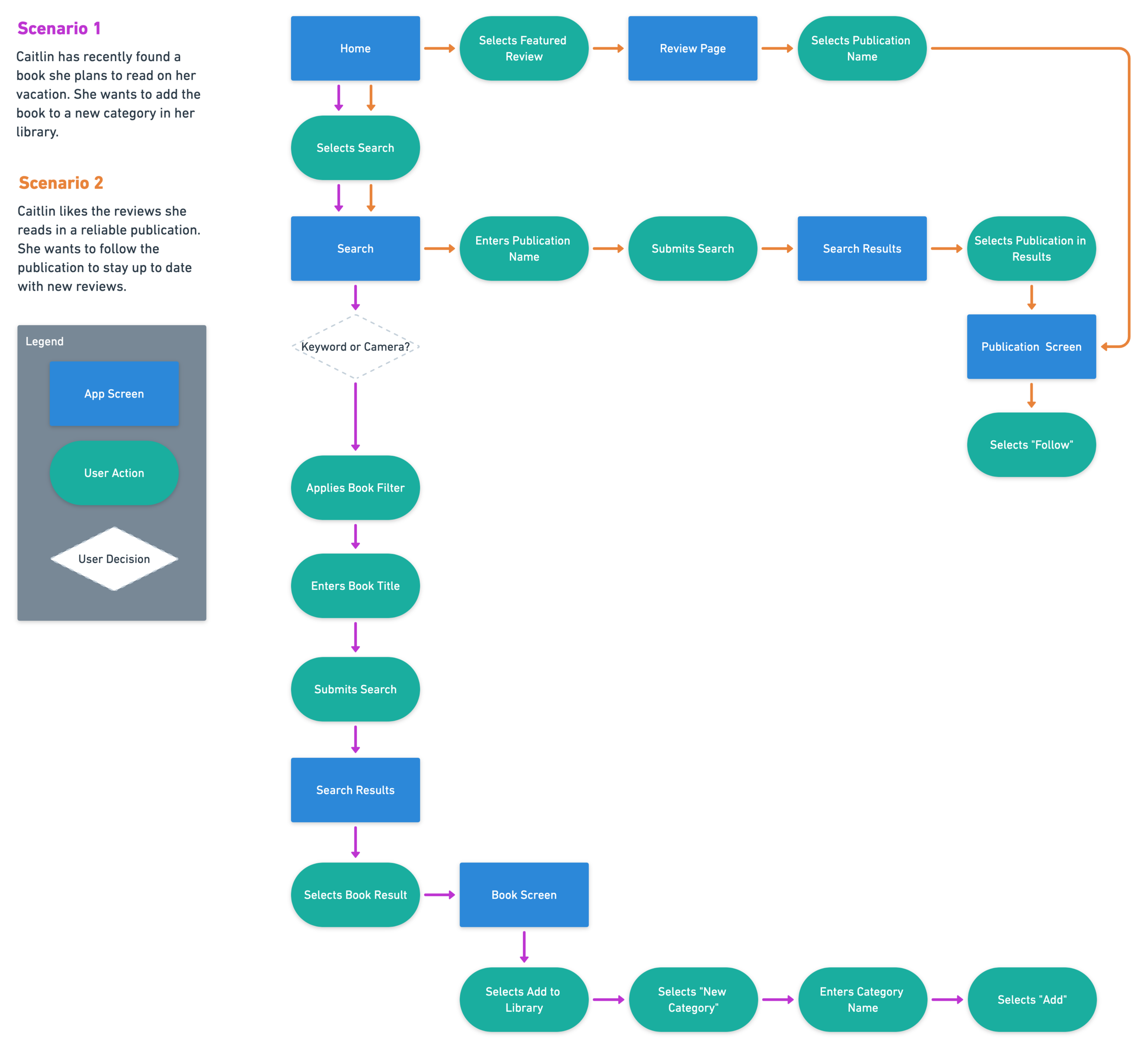
User Flow
Considering Caitlin’s needs and the project goals, I created a diagram that described the pathways users might take while interacting with Book Ink. This process helped me to identify the key screens and actions users might require.
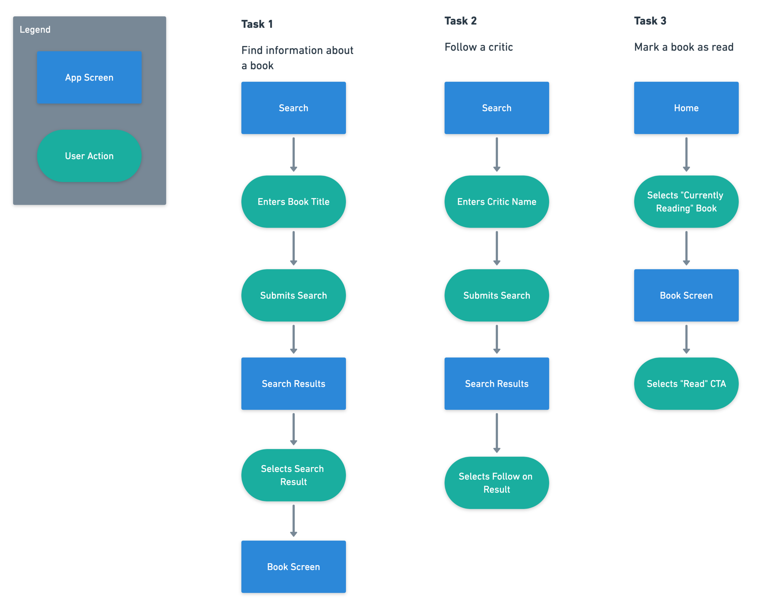
Task Flow
I also considered several key tasks that a user like Caitlin might need to complete using Book Ink. This further helped me to determine the screens and actions that were necessary for accomplishing the tasks.

Design
Goal: To design layout, look, and feel of Book Ink.’s mobile app
Process: Sketches | Mid-Fidelity Wireframes | Branding | Style Tile
Sketches
The first step of the design phase was to take pen to paper and sketch ideas for some of the main Book Ink. screens. These low-fidelity wireframes helped me to determine layouts and establish visual hierarchy, while exploring common design patterns and figuring out how to integrate the app’s key features.

Mid-Fidelity WireFrames
I followed up the sketches by creating mid-fidelity wireframes, translating the sketches to a digital form and preparing for usability testing. By building the wireframes in grayscale, I was able to focus on the functionality of the features.

Branding
I began to develop branding for Book Ink. by identifying 3 brand attributes that captures the intended look and feel of the app: Delightful, Trustworthy, Contemporary. With these adjectives in mind, I sketched out ideas for the brand logo, before digitizing the concept that fit the attributes most effectively.

Style Tile
Next, I created a style tile as a guide for the visual design of the app, establishing a color palette, typography styles, and imagery that would then be applied across the mid-fidelity wireframes.


Prototype
Goal: To develop a model for the Book Ink. app that could be tested and improved
Process: Prototype | Usability Testing | Affinity Map
Prototype
Before applying the branding and visual style to the wireframes, I needed to test the design of the features to determine if they could be successfully used to accomplish key tasks. I created a prototype using the mid-fidelity wireframes and recruited participants to test it. This helped me evaluate the ease of use of the app and identify any potential points of confusion.
Usability Testing
I created a test plan in preparation for conducting usability testing. I developed 4 scenarios and 4 tasks that I asked users to complete using the prototype in order to evaluate the design. Participants were recruited from the local community and recorded each session so I could later synthesize my findings.
Tasks
Find and add the book The Shining to your favorites
Find and follow the New York Times
Find the book, Little Fires Everywhere, and create and add it to a new list, Vacation
Find related content for The Great Gatsby
Summary
Number of Participants: 5
Age: 23 - 55
Gender Breakdown: 3 female / 2 male
All participants described themselves as frequent readers or book lovers
AFFINITY MAP
Similar to the empathy map method used to synthesize the user interview findings, I created an affinity map in order to gather insights from my usability testing. I identified the patterns that emerged in order to determine what revisions should be made to the next iteration of the prototype.

Insights
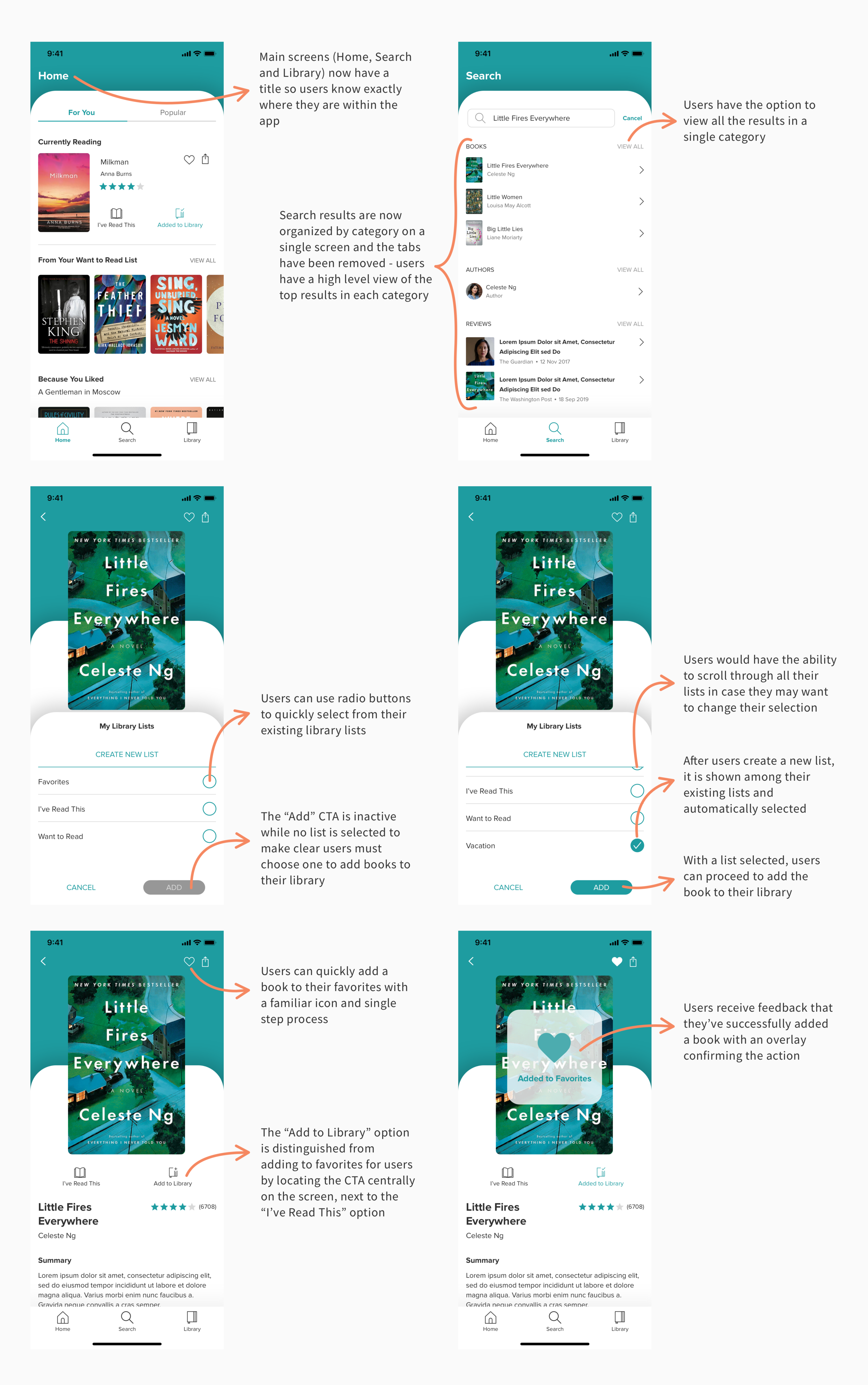
Users were unsure when they had completed adding a new list to their library
Users were unclear which page they were on when using navigation bar
Users did not always understand the distinction between the Add to Favorites and Add to Library CTA
Users relied on the Search to find books, but did not need the different tabs
Recommendations (From High to Low Priority)
Make the Add button inactive until a list has been selected or created
Use an outline or similar indicator to emphasize when a list has been selected to add a book
Add page titles to Home, Search, and Library pages
Move Favorite icon above book cover image, near, move Add to Library CTA next to Mark as Read CTA
Remove tabs, show search results by section (Books, Tags, Reviews, Authors)

Iterate
Goal: To implement the visual design and revise the prototype based on usability testing
Process: High-Fidelity Wireframes | Revised Prototype | UI Kit
High-Fidelity WireFrames
The visual design and branding defined in the style tile were applied to the mid-fidelity wireframes to create high-fidelity wireframes. The recommendations identified above were implemented as well, in order to address sources of confusion and frustration that emerged during usability testing. Those specific changes are outlined in the wireframe annotations below.
Revised Prototype
Those high-fidelity wireframes were then used to create a revised prototype. This version captures the intended look and feel of the app and improves upon the mid-fidelity prototype by including the recommended revisions determined from usability testing. Feel free to interact with the Invision prototype via the button below.
UI Kit
Finally, having applied the Book Ink. style and branding to the layouts defined in the mid-fidelity wireframes, I created a UI Kit. This is a living document that can serve as a resource, ensuring that the visual design remains consistent as the app is further developed.

project takeaways
Find the right design pattern.
Sometimes there are multiple ways to design a feature, all of which are functional and intuitive for users. But context matters, so what may work for one app and particular type of content might not work for another. That was the challenge for me as I began to develop wireframes and usability testing was invaluable in determining the right design pattern to use.
Users will tell you what they need.
Maybe not directly, but the frustrations users voiced or the positive experiences participants mentioned in interviews told me what they would need from the Book Ink. app. The project brief is a starting point, and I found it was okay to deviate from it as I learned more about users. The features that were ultimately implemented reflect goals defined as a result of the research findings.
Next Steps
With additional time, I would like to build out the existing features, especially those that require content from external sources. For example, critic reviews and related content, such as information on tv adaptations, might come from a variety of websites. It would be valuable to explore how users would access that content via Book Ink.